 |
|
Why images sometimes get cut up
Items that output as one single image
Using the HTML Layout option to identify problems
Using the Site palette to optimise your pages
Align objects to create better HTML
Multiple tables - why they are used and when to prevent them
|
After you become familiar with working in Freeway, you'll probably want to understand more about what's happening in the output and the options Freeway has to help you here. In this chapter, we're going to discuss how to diagnose layout problems that occur and how to optimise the HTML output from Freeway.
How layout is preservedWhen you position objects on the Freeway page, they appear in the browser exactly where you saw them (browser margins aside - see below). In order to get them there, and make sure they stay there under all circumstances, Freeway has to do a lot of work behind the scenes. Layout is preserved in the HTML output using HTML tables. Freeway has to calculate an invisible system of rows and columns which will result in table cells the correct sizes to represent the boxes drawn on the page, the spaces between them, and the spaces between them and the edges of the page. Before the days of WYSIWYG Web publishing tools, you had to calculate these tables yourself, which was a complex and time consuming task. Under certain conditions, when such layout tables are viewed in Web browsers, the browsers compress the tables, distorting the layout. To get around this, the table structure is reinforced by a system of invisible graphics. Using one transparent single-pixel GIF graphic, which is used repeatedly and scaled in the HTML code to be the correct width or height, Freeway ensures that there is no way for the browsers to distort the tables. The graphic in use is named _clear.gif, and is always output in the destination folder. You must ensure that this graphic is always uploaded with the rest of the site files to avoid problems. What are browser margins?Browser margins are the space that is added at the left and top of the browser window. You may have noticed that when you align objects with the top or left hand edge of the Freeway page, then preview the page in a Web browser, the objects display in the browser slightly offset down and to the right, leaving a margin between themselves and the actual edge of the browser window. The gap that occurs is due to the space created by the browser margins.
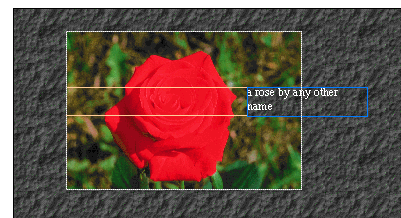
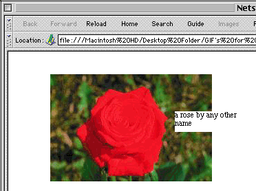
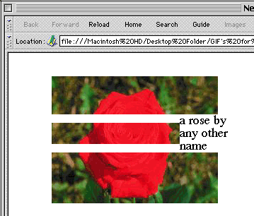
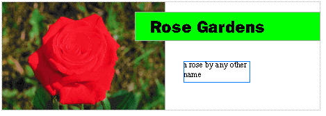
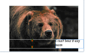
This space occurs for one of two reasons, depending on the browser you're using. In the Netscape browser, these margins are automatically created by default, and there is no way to either change their size or turn them off. This means that it is impossible to get elements to display right up to the top or left hand edges of the Netscape browser window (except by defining them as a background image). The Microsoft Internet Explorer browser, on the other hand, has no default margins, and content would normally display starting at the top or left hand edge. Explorer does however support specific commands which allow the creation of browser margins. If Freeway didn't take account of this difference in its output, your pages would look rather different, depending on which browser they were viewed in. To prevent pages looking different in the two browsers, Freeway uses the commands supported by Explorer to set the browser margins to the same values that are used by default in the Netscape browser. You can preview the actual background area in Freeway by turning off Clip Background on the View menu. Why images sometimes get cut upEvery image on the page is normally output in its own layout table cell, with one exception. If you have an HTML element (such as an HTML text box, a form control, a pass-through graphic, or a multimedia element) which overlaps an image, the image is cut up by Freeway, and the part which is overlapped by the HTML element can't be output. Each of the cut parts is output in its own layout table cell. You can see this effect by moving any HTML text box so it partly overlaps a graphic - the area of the graphic behind the HTML box disappears showing the page background color or image. The rest of the image will be cut up horizontally along the top and/or the bottom of the HTML box.
When the image is output, the pieces are named individually, with the basic name normally being based on the title of the graphic, suffixed with the letters A,B,C and so on.
Images that are cut up can give rise to layouts that break, as described in the next section. Layouts that breakYou may find that you have created a layout which breaks up when previewed in the Web browser under certain circumstances - such circumstances may occur when the page is viewed on a Windows PC, or the visitor's Web browser is set to use a larger text size than the default, for example. The commonest cause of problems are images that are cut up by overlapping HTML elements so that if the contents of the HTML element end up larger than the size of the table cell which contains them in the output, the table cell expands vertically and the cut parts of the image may be forced apart. To help keep the parts of the cut graphic together when adjacent cells expand, HTML commands are used which press each image against the edge of its cell, so that adjacent parts of the image are pressed together if the cells become larger than the images themselves.
Problems come when you have three cut segments in a row - the two end ones can be aligned so they push towards each other, but the center one can't be aligned to both the others at the same time. The center one ends up orphaned if the table stretches, leaving a gap between it and it's neighbours above and below.
You need to allow plenty of space inside HTML page elements for the contents to expand without expanding their cell in this way - this is of particular importance when creating HTML text boxes. Always leave as much extra room as you can by making HTML text boxes longer than they have to be. One of the 'secrets' that isn't obvious when you start doing Web design on a Mac is that screen font sizes for text are about a third larger on Windows PC's. This means that even if someone browsing your pages on a Windows machine hasn't increased the default text size in their browser, your page layout could still break. Items that output as one single imagePart one - Accidents will happenYou should be aware by now that image elements which are overlapped on the Freeway page create a single larger image on output. What may not be so obvious is that this can happen by accident, and the effects can be dramatic. The image that is created on output will be the size of a rectangle big enough to include the complete area of both the original images. An example of when this can cause real problems is where you have page elements which may not overlap either of the original images, but still fall wholly or partially inside the area of the large output image.
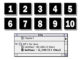
This can get you into all sorts of trouble if the elements which get included in this way are HTML text boxes which aren't sized so that there is room for the contents to expand safely, as described in the previous section. Be wary of unintentional overlaps, as they can cause real problems down the track. Part two - Combining images for efficiencyUnintentional overlaps between graphic page elements can make life harder - but intentional overlaps can make your pages more efficient and download faster. Picture a page which consists solely of ten graphic buttons. Each button is output as a separate image. This page can actually take a lot of server resources to process, and may download slowly, despite the fact that each of the images created may be quite small.
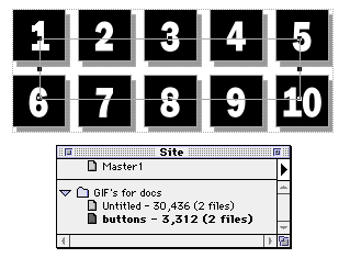
This is due to several factors; first, the HTML table needed to reproduce the layout will be fairly complex, expecially if the buttons aren't all the same size and aligned properly, which makes your HTML page bigger; second, the server will need to process ten requests for images, which adds to the server overhead and makes everything slow down on a busy server; third, there's a certain amount of overhead required for each individual image - some information is needlessly duplicated in each one. The answer may be to combine your images into one. This helps by the following: making a much simpler layout table and a smaller HTML file; requiring only one graphic to be requested from the server; making more efficient use of the graphic, as there is no redundant information. To achieve this, simply draw an empty graphic box over the individual graphics on the page, which will cause them all to be combined into an image group and output as one.
Using the HTML Layout option to identify problemsYou can see how the layout of the page will be reproduced in the output by turning on the HTML Layout option on the View menu in Freeway. This causes the bounds of the table and cuts in images to be reproduced on screen using colored lines. When an image is cut up, red arrows indicate areas where the parts of the image can't be aligned.
If you see these, you may need to locate the HTML element which is causing the cuts and make it large enough so that the contents can grow without forcing the output table cell to grow larger. Keeping files small for speedOne of the most important disciplines to learn is keeping your output files as compact as possible. You need to remember that whether your visitors are connected via a fast T1 line, or over a 14.4 modem, the Net gets slower the more people are using it, and achieved data transfer speeds will often be very slow over any connection. The bigger your files, the longer the pages will take to download to a visitor's machine. The slower a site loads, the more likely the visitor is to hit the switch and head off to another site. On commercial sites, large graphics equal lost business. A useful rule of thumb is that every 1Kb of data will take on average 1 second to download over a slow connection or if the Net is busy at that moment. This means a 30Kb page, including graphics, could well take up to 30 seconds to download completely. 30 seconds is a long time to wait for something interesting to happen - if you're not convinced yet, try sitting still now, doing nothing, for thirty seconds and see how long it feels. The amazing thing is not how many people give up waiting for top-heavy pages to download, but how many actually sit still and take it! Be kind to your visitors, and make sure you have done everything in your power to make the site quick and easy to navigate. When checking file sizes, remember that viewing file sizes in the MacOS Finder is prone to inaccuracy. There are two things that can catch you out, making you think that your files are larger than they really are: 1. Finder file sizes are misleadingFirst of all, the file sizes shown in the list views in Finder are misleading for small files - regardless of the actual size of the file, the sizes reported here are given in multiples of the block size of your hard drive - on large drives this can be 16, 32 or even 64 Kb. No file can take less room than the block size, and large numbers of very small files take up an astonishing amount of disk space, most of it wasted. To check this out, try selecting the site destination folder in the Finder, and do Get Info from the File menu. For size, you'll see two values given. The first is the accumulated size of the allocation blocks used up - the second, smaller value is the actual amount of physical data which is stored in those allocation blocks. 2. Resource forks don't countHaving read rule number one above, we know that Finder list views don't tell you the truth about the amount of data stored on the disk. The second catch is that Macintosh files are composed of two parts (or 'forks'); the data fork and the resource fork. Without getting into a detailed discussion of Mac files, the point to remember is that on the Web, only the data fork counts - any information stored in the resource fork is irrelevant, and not used This means that even using the Get Info command in the Finder, you may be misled into thinking that your files are larger than they are, for Web publishing purposes at any rate. The resource fork will normally be pretty small, but in the hyper-optimized, byte-sensitive world of the Web, small amounts of data suddenly loom large in a Web publisher's thoughts. Examples of what goes into the resource fork are the previews Photoshop can save with your files. There are tools which can strip off the resource fork from your files, so you can judge more accurately how heavy they are to download, but there's an easier way to check output file sizes using Freeway's Site palette, as described in the next section. Using the Site palette to optimise your pagesThe Site palette can give you a whole lot of vital information if you learn to use it properly. For starters, make it work for you. Freeway defaults to showing all the items on every page in the site, but you can make the display more user-friendly for normal use by using the popout menu on the Site palette to switch to Show Pages instead of Show Items. It's much easier to navigate the site with the items hidden. Next, once you have done most of the design work, you can switch the palette from showing the names of the master page elements responsible for your pages and items, to showing the output file sizes. Do this by choosing Show File Sizes from the Site palette popout menu. Now, after every time you use the Preview or Publish command, Freeway will report the total size in bytes for every page, including graphics that are output for that page. Rest assured - these are real data sizes, not the size including resource fork information.
Another rule of thumb is that as long as your pages are under about 32,000 bytes or so, you can rest easy, more or less. If you have page sizes greater than this, you may want to think about reducing the weight somehow. Turn the site palette back onto Show Items, and check the file sizes shown for the graphic objects on the page - this is a quick way to spot whether you just have one or two really big images which can be fine-tuned. (If not, you may want to consider splitting the page contents onto two or more pages.) If you want to fine-tune some of your graphics, turn on Graphics Preview from the View menu, and use the controls on the Export panel of the Inspector palette to optimise the compression for JPEG images or the palette and number of colors for GIF images. Experiment with changing from JPEG to GIF or vice versa to see if it helps. This will also help you learn which format is better for different types of subject matter. Creating Nested tablesFreeway 1.0.1 uses nested tables in its HTML output. This has the advantage of preserving HTML layouts which might otherwise break up when viewed in a browser, and also gives the user control over features such as the tabbing order of form items. Nested tables can be viewed using the View HTML Layout option: table outlines are displayed with a dark blue dotted line. Freeway may create nested tables automatically, or you can create them manually. TIP: it is easier to view HTML table and cell outlines if you turn off 'View Item Frame' in the View menu. Automatic Nested TablesNested tables are generated automatically in cases where this will help to prevent the HTML layout from breaking up. This typically happens when several graphic boxes are in the same horizontal area as an HTML text box or control item. As described above in the section 'Layouts that break', when the HTML text is displayed in a browser, the table may be extended vertically to make room for it if the browser's font size is greater than the size chosen in Freeway. (This commonly happens with PC browsers: PC screen-font sizes are larger than the 'equivalent' Mac sizes.) Freeway detects cases where this is likely to happen and places the graphic items in a nested table so that they will stay together if the main table is stretched by the browser. Manually creating Nested TablesNested tables can also be defined manually, by enclosing layout items inside an HTML box which does not have any content of its own (it can have a background colour). This is similar to the way that images are grouped into a single image if they are enclosed in a larger graphic box, except that nested tables cannot be overlapped by other items. HTML boxes which are used to define nested tables cannot be partially overlapped by other elements. They must also have at least one pixel width of clear space before their right and bottom edges, after any enclosed items. (This is needed to define the internal structure of the table in HTML.) Freeway does not create nested tables if there is not at least one unnested item in the same outer table - there is no advantage in having a nested table in this case. Tables cannot be nested inside other nested tables (there is only one level of nesting). If you move items which form a nested table inside another HTML box, the bounds of the nested table will be defined by the bounds of the outermost box. Try doing this with the View HTML Layout option switched on so you can see the way the table structure changes. A common situation in which nested tables are useful is where a group of adjacent graphics might otherwise be broken up when a page is viewed in a browser (typically when the size of some adjacent text is increased). By placing the graphics in a nested table, you can prevent this from happening. Nested tables are also useful when you want to control the tabbing order of form items: if you have two columns of tabbing items, and you want to make them tab vertically within each column (rather than horizontally between columns), you can do this by placing each column inside a nested table. User-nested tables take precedence over automatically nested tables. If a situation arises in which Freeway groups unrelated items into a nested table, you can prevent this happening by using your own nested tables to define the correct relationship.
Align objects to create better HTMLDesigners often use guides to create layout grids which help them to keep page elements in alignment. This helps in creating a clean, coherent visual impression. However, in Web publishing using tables for layout, it can also have a dramatic effect on the quality of the HTML output. If you have layout elements on the page which don't quite line up with each other, then the table structure required to reproduce the page becomes dramatically more complex, with lots of short, narrow cells being created in the areas where edges don't align. This makes your HTML output bloated and slow, for no practical reason. Take care that your box edges are snapped to common guides or the page edge whenever possible. Even when there is no need for boxes to be made touching, it's often better to do so to reduce the number of rectangular areas that need to be exported. Once again, you can use the Site palette with Show File Sizes turned on to give you feedback on what the effects of object alignment are on the output file size. For a simple experiment, create some differently-sized boxes on a page which don't line up with each other, and with the site palette open, use Command-P (for Publish) to check the page file size that results. Next, line the items up using a guide and make sure they are all the same size, then do Command-P again. You should find a satisfactory reduction in the size of the HTML file created. Use the same experiment on your own pages to see by how much you can reduce them. Multiple tables - why they are used and when to prevent themFreeway doesn't necessarily output a page as a single layout table - in some cases, it may output the page as two or more layout tables. The number of tables used depends on whether or not Freeway detects a completely unbroken gap across the page where no page elements occur. If it sees such a gap, of two pixels in height or more, then it will cause two output tables to be created. The rationale behind this is to improve the performance of long pages loading in the browser window. As well as the total time taken to download the page, an important consideration for the Web surfer is the length of time it takes for the page contents to start displaying. Estimates vary, but chances are that on average you could have as little as five seconds for something to happen when the page is loading, or the visitor will take themselves somewhere else. The main issue with page loading times using single tables for an entire page is that until the entire table has downloaded, nothing gets displayed. If Freeway divides a long page up into multiple layout tables, however, the first table starts to draw as soon as it is downloaded, even though the rest of the page is still coming down. In many cases, it also creates less complex individual tables when Freeway uses multiple layout tables to describe the page. This behaviour may very occasionally hinder rather than help things, though. There are cases where a very simple page will be output as multiple tables when this is not going to help - an example of this would be if one had a short page with three simple elements arranged one above the other. In this specific case, the HTML file generated is likely to be inefficient and take longer to load than necessary. To prevent Freeway from generating multiple tables, all you need to do is ensure that there are no gaps right across the page. (And of course, to cause a long page to be split, just make sure that there is a gap right across the page...) An excellent way of achieving this is to draw an empty HTML box right down the side of the page. Using the site palette with Show File Sizes turned on, as described in the section above, you can experiment with different HTML layouts, adding empty HTML boxes where necessary, to see what gives the smallest HTML file size. What to do if the output doesn't match your pageOnce in a while you may find that the page as viewed in the browser fails to match that seen in Freeway - these are cases in which a graphic element has perhaps failed to be updated after a change, or you have changed the filename for a page, and links to it no longer work, for example. Causes of this may be things like the browser displaying a version which it has 'cached' locally, rather than a later version which Freeway has output, or in exceptionally rare cases, Freeway may have failed to output items which need to be re-exported. There are three things to try if you feel something like the above may be going on, and they are best performed in the order given. 1. Force the browser to reload the images from the Freeway destination folder. To do this in Netscape, hold down the Option key on the Keyboard and choose View-Reload, or hold down Option as you press the Reload button on the Netscape menu bar. Alternatively, if this fails, you can close the browser window and then use the Preview command again within Freeway. 2. Force Freeway to re-export everything on the page in question. To do this, choose Force Republish from the Page menu while viewing the page containing the offending items - this marks everything on the page as needing rebuilt, and the next time you publish or preview the site, the entire page content will be remade. 3. Force Freeway to rebuild the entire site. To do this, hold down the Ctrl key on the leyboard, as you choose Publish from the File menu. This will cause the entire site to be output, replacing the existing content in the destination folder. This is rarely necessary, and can take some time to complete in a large site. |
|||
Back to the top |
|||
